Everyone knows and loves the classic red telephone booth, present in just about every city, and a key figure in many famous rom-coms. But lately, these bright spots of color and nostalgia have been ruined by dull, gray, lifeless phone boxes. This trend needs to cease before more vitality is ripped from our world—degrading the joy the small things bring.
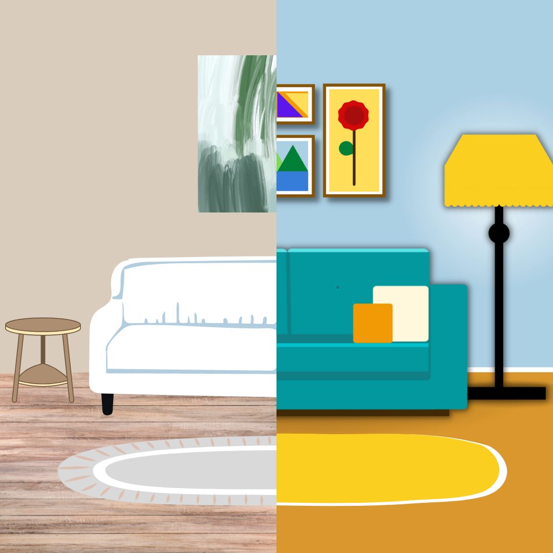
Over the past five years, color has been slowly leached from our world. The internet is full of “beige moms” minimizing bright colors for their children, along with home improvement buffs that strip down and replace 19th and 20th-century styled furniture in favor of basic shapes, dull colors and an open floor plan; simplicity is replacing personality. Minimalist design is now a trend around the globe, and individualism and culture are paying the price.
Minimalism is a style of living that emphasizes only using the bare essentials and is intended to bring focus to the “true nature” of a design or space. Simple designs draw the viewer’s attention to the focal point, without any excess details to distract them, making them a popular choice for today’s companies and artists. However, what arose from an attempt to remove excess in our world has turned into a trend that’s destroyed classic furniture and landmarks, and left cities and homes dull and flavorless.
In modern culture, minimalism is popular in architecture and interior design. This aspect of minimalism is seen clearly in the replacement of classic red telephone booths. These booths had color and detail that gave them character, making them something bright to look upon, even on a dreary day. Similarly, artfully crafted pieces of furniture bring a home to life, especially when paired with friendly, detailed artwork on the walls.
By contrast, minimalist homes lack creativity and personality. Their walls are bare or filled with plain, geometric shapes. Once filled with energy, these same walls were doubtlessly remodeled by a minimalist designer attempting to make the home like every other. Now, most homes share minimalist features and cannot be told apart by a glance. Where has individuality gone?
Minimalist design trends have also had an impact on artwork, including logo design. Modern art is centered around geometric shapes with few colors, using more abstract methods to convey simple ideas. Many are appalled by these new pieces, trying to compare them to the works of art they are used to. Logo evolution over the years shows that logo designers are also hopping on this trend, trying to become more recognizable to customers. This has the same overall impact as modern art: diminishing logos appeal by making them, quite frankly, boring.
These trends have had a large impact on the online community, as they’ve seen the beautiful things they once knew stripped down to their necessary parts. Many social media users are outraged at the destruction of old homes in favor of open, simpler designs. They lament the “death” of classic logos, such as the Pringles Man, whose redesign in 2020 removed his color and the sparkle in his eyes; rightfully so, since the personality behind the logo contributed excitement to everyday life. Some even provide open criticism of others, furious at the lack of color that some children are growing up in due to their “beige moms” dressing everything in neutral tones. While online conflicts may seem unnecessary, they reflect how distasteful minimalist trends are, and indicate that they should be stopped.
So, when will it end? When every scrap of color and personality has been leached from the world? Are we to become as lifeless as the minimalist architecture that surrounds us? Minimalist trends must be put down before we can only fondly remember the individuality we once had.


